I sat on this interview for months before finally sitting down to craft this post.
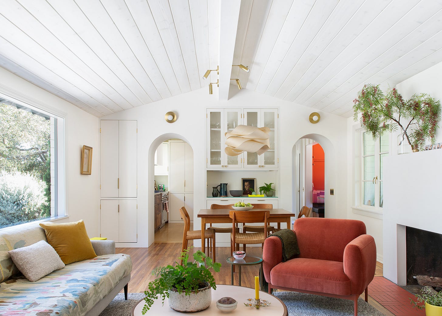
My delay was not because this was a personal essay or something hard to write. Earlier this summer I spotted California architect Merritt Amanti Palminteri’s work on Dwell.com and loved what I saw. I wanted to know more about her home renovation, so I reached out to ask if I might interview her for LIVING SMALL. However, within the first ten minutes of our call, I realized that the house I thought was “small” was pretty big at 1,700 square feet.
So I mulled over how to present it to you, dear readers. It wasn’t small, it wasn’t acutely sustainable, but it was packed with design inspiration and smart ideas nonetheless.
Then last week, while recording a podcast, the interviewer asked me how I defined small. I found myself laying out the parameters for the homes I included in my book, but then I caught myself: Small is relative, I said. Your idea of small and my idea of small might be very different.
In fact, Merriam-Webster gives the primary definition of “small” as “having comparatively little size or slight dimensions.” Note that comparatively is the key word here. For some, two thousand square feet may feel tight after living in twice that space. In my twenties, my 250-square-foot studio felt palatial compared to the shared county park cabin I had lived in the summer before. Small is relative—and your idea of small may change over time.
Merritt’s house is large compared to my 690-square foot apartment, but comparatively small next to the average house in the U.S. (just over 2,000 square feet) and the average newly-built home (closer to 2,500 square feet). Having lived in New York City for many years herself, Merritt doesn’t consider her home small either–even with a family of five living there.
Merritt and her husband also chose to keep their home small. They knew they needed to renovate, and initially they had planned to modestly expand the midcentury house. “We thought, ‘Let's knock down the carport, expand the kitchen, and add a whole primary suite,’” says Merritt. “We had my initial scheme bid and it was so expensive it was just kind of silly.” Merritt realized that even though it would be nice to add symmetry to the architecture and that a primary suite would potentially add value to the house, they wouldn’t enjoy living in a larger house any more than their current house.
Once Merritt ditched the idea of expanding the house, she says she “treated the footprint like we live in an apartment and there is no option of expanding.” With this new lens, she realized she could renovate in a way that “luxuriated a little bit more in the details” and she’d have the budget for some interesting finishes. Making the most of the space you have? That, my friends, is the very essence of living small.
Photographs by Suzanna Scott courtesy of Merritt Amanti Palminteri.
Here are 7 lessons from architect Merritt Amanti Palminteri’s charming California home:
Live in your home before you renovate
There are many reasons to inhabit a home before you renovate (chief among them is to recoup your finances after the purchase!). Merritt and her family bought their house in 2012 and lived in it for years before they did anything. Then they renovated over time as their budget allowed with one final big renovation of the kitchen and living room completed in early 2020 (and seen here). Living there taught Merritt things about the house she might not have known if they’d redone it right away, like for example, that the best light in the house was in the laundry room.
Merritt was also busy in those early years. “We had little kids, including twin babies,” she recalls. “Everything was just really simple and we didn't really want to fill it up with stuff—nor do we have the money to. So we took a while to renovate.” This is a reminder not to beat yourself up about the home renovations you have not yet tackled.
Do sweat the details
Looking at Merritt’s home, I was struck by all the small, but thoughtful details. For example, the outlets are all black with simple brass plates. These are not much more expensive than the standard issue white plastic, but they feel so much more considered and finished. Merritt says she honed her attention to detail while working for architect Anik Pearson. “It’s a firm where the emphasis was converting what was considered a small apartment into a jewel box.”
Invest in cabinets
Essential to creating those jewel box homes is “nice lovely custom casework,” according to Merritt. Closed-door cabinets and good built-ins are also the secret to the casual-yet-pulled-together vibe of Merritt’s home. When I asked her about kid clutter, she said, “It's a matter of choosing furnishings that allow for some clutter, you know, enough drawers to hide things.”
Choose materials for everyday living
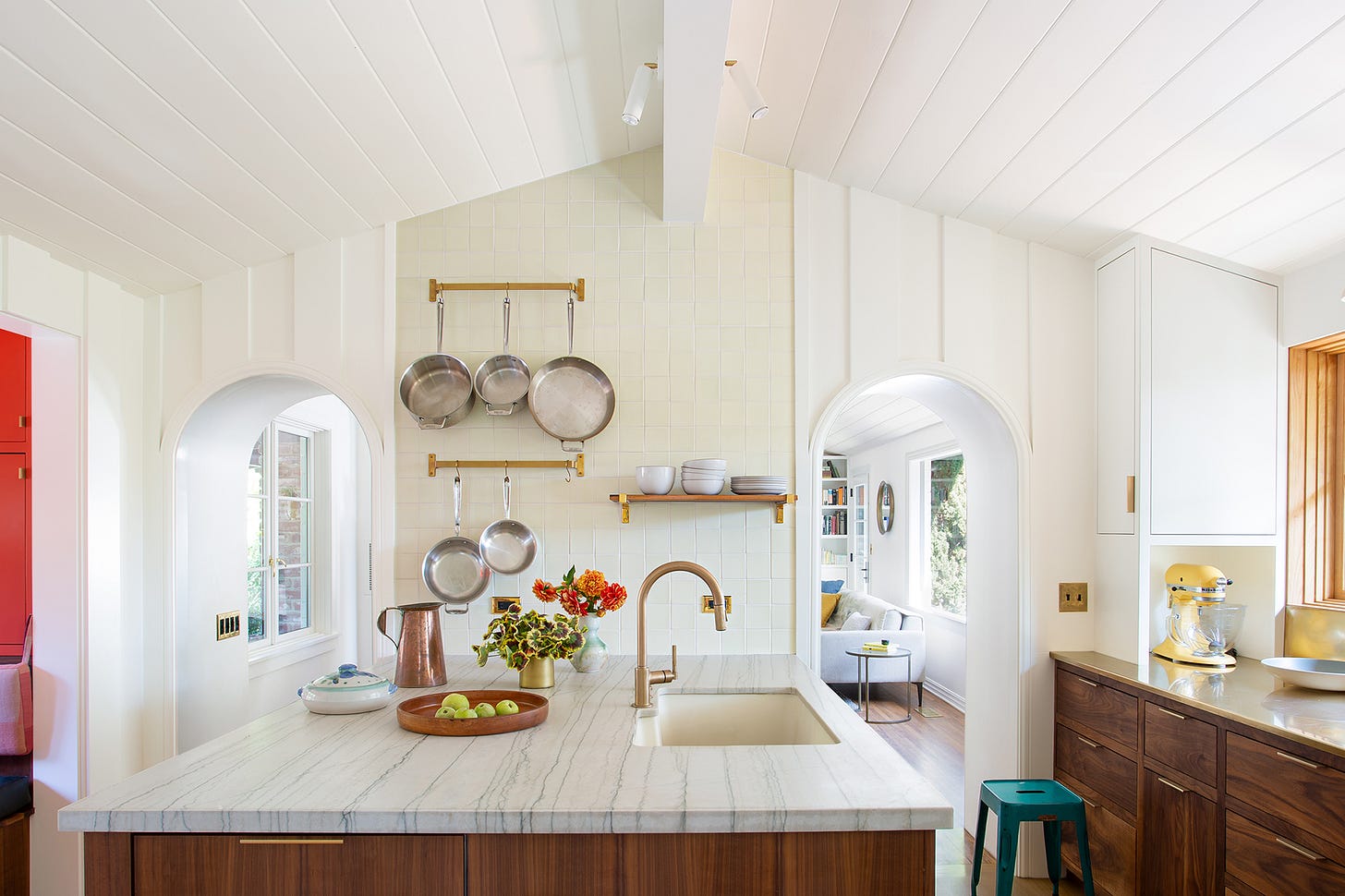
A mom of three, Merritt looked for finishes that are meant to patina, including the brass countertops. “It’s about anticipating places where there might be damage and designing with materials that don't look bad if they get dinged or just are more durable,” says Merritt. Below the counters she opted for stained walnut casework, noting that wood is more forgiving of dings than painted cabinetry. Merritt also paid particular attention to the hardware she chose. “The reason why you have hardware on cabinets is to protect the paint finish,” she says. “Select your cabinet knobs in a thoughtful way because you're going to be touching those cabinets all the time.” (Merritt went for affordable, minimal brass pulls.) Merritt opted for a durable quartzite island countertop, saying, “We picked a stone that you could leave crumbs on the counter and not notice.”
Take advantage of light and air
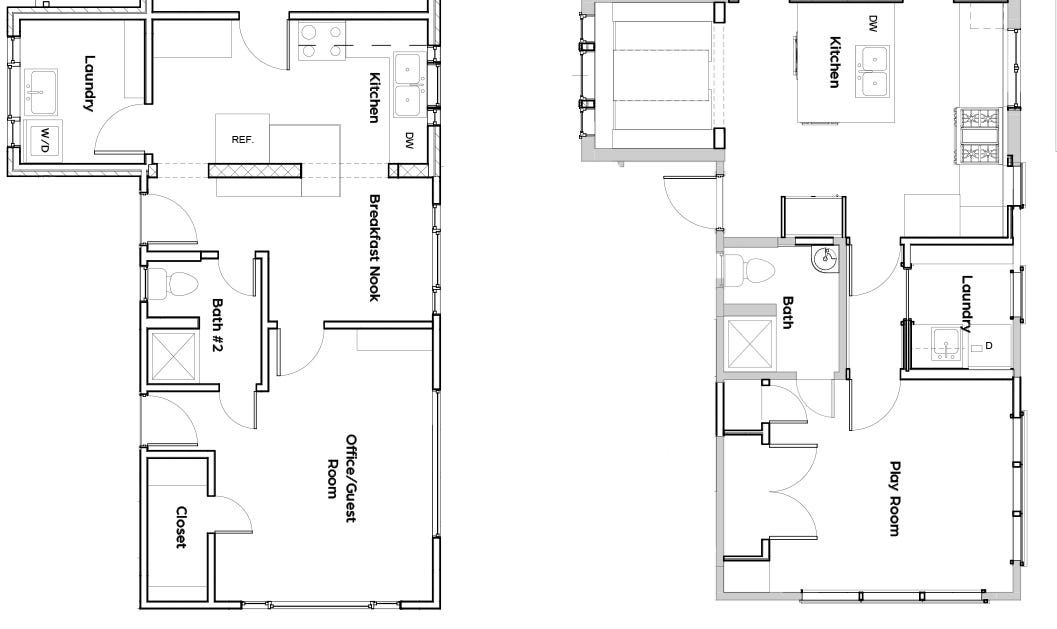
“It's a very basic design principle, but you need to consider where the best views are,” says Merritt. “Just living there and knowing where the light is, where you need ventilation, is really important.” In her case, the enclosed laundry room had “the most beautiful evening light.” So, she reoriented the laundry room to a back corner and brought the warm afternoon sunlight into a new kitchen.
Consider a nook
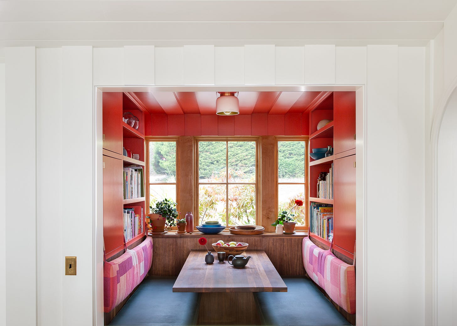
When Merritt reimagined the floorplan, she knew she wanted to incorporate the former laundry room into the kitchen. She ended up turning the space into a breakfast nook surrounded by built-ins (one of my favorite parts of this house!). Merritt built in storage below the seat for things they wanted to keep out of sight (random trays, craft supplies, and “the box of See's bridge mix we keep hidden from the boys”) while the shelving was designed to display her collection of midcentury pottery. The nook has turned out to be a kid magnet, especially when they entertain: Merritt likened it to a late-night diner booth.
Psssst…. That amazing wall color? It’s Benjamin Moore’s "Habanero Pepper."
Tweak the existing architecture
Merritt transformed the floorplan of the house, but she also changed the space in other ways. In the kitchen and living room, Merritt removed the dropped ceilings to expose the roof’s vault, and she arched and deepened the doorframes between the two rooms. “When creating passages between rooms, you can tuck cabinetry into deeper wall sections,” says Merritt. “It feels good when there's a big distinction between one room to the next, and then you can use that space for shelves, drawers, or closets.”
See more of Merritt’s work on her site merrittamanti.com and on Instagram @maparchitect
Further reading
Merritt’s house called to mind one of my favorite books about architecture: A Pattern Language, which is an out-of-print title about architecture, building, and planning written in 1977 by some Berkeley professors. Gretchen Rubin mentioned it to me when I interviewed her for a story years ago, saying it was what convinced her to create “secret places” in her home. I was, of course, intrigued.
Related post from the archive:
The power of micro makeovers
I long to be the type of homeowner, who churns out projects with dramatic before-and-after shots. But in my own home, I’m more tortoise than hare.
+ The most-clicked link from last week: You guys liked this simple sewing pattern.
3 More Things
A product I’m excited about
I’ve been singing the praises of self-adhesive window film ever since I lived in a ground-floor apartment that faced the street. Frosted film gave me much-needed privacy without sacrificing precious daylight, and it was cheap and easy to DIY. So I was intrigued when Remodelista shared a window film that replicates the look of reeded glass. They linked to one from the U.K. , but there seem to be many options available stateside.
Cold-weather seed sowing
I always thought of spring as the time to sow seeds, but the pros suggest sowing native seeds now.
from Avant Gardener walks readers through the process here, and Heather McCargo from the Wild Seed Project shares pretty much the same method. I’m thinking about ordering some seeds and giving it a try: Would you like to read about it?Something to toast
Last week I attended a party celebrating the launch of
’s Substack, The Big Salad, and I don’t think I’ve been in the room with so many fellow writers at one time! Along with all the beautiful food and schmancy cocktails, they were serving Ghia’s Le Spritz. I am not usually one for a pre-mixed mockktail, but the Salt & Lime flavor was out-of-this-world delicious. Now I want to try all the flavors.One last thing: A nearly-complete archive of the Whole Earth Catalog!
That’s all for this week, friends! If you enjoyed this post, please share it! When readers share my writing, it helps this newsletter grow.


Dying over that breakfast nook with the built-in bookshelves! What a gem of a house.
Gosh those double archways!! Another terrific newsletter Laura :)